M.O. FRUITS & VEGGIES
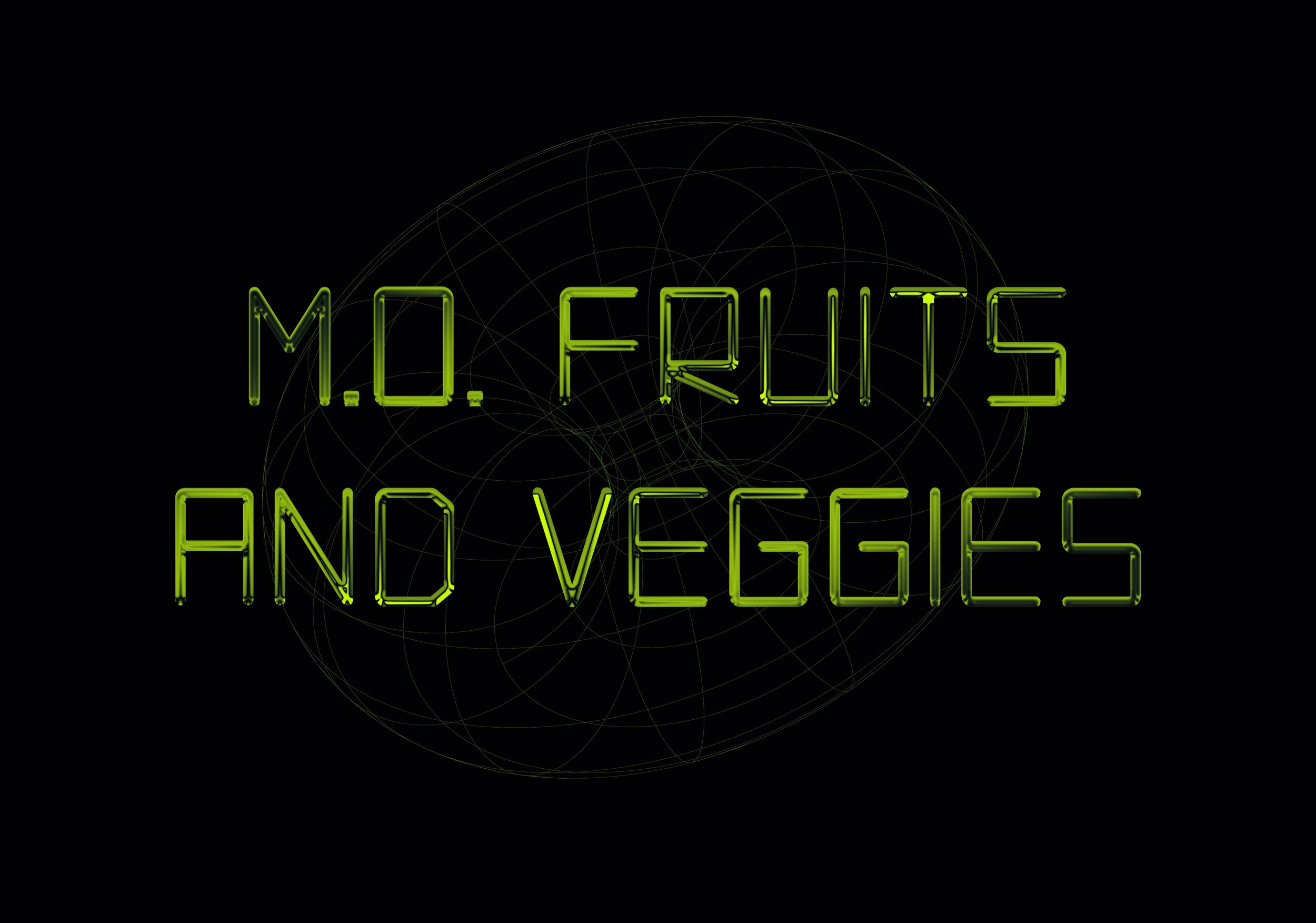
M.O. Fruits and Veggies is a typeface that was born from a hand painted, nostalgic Harrisonburg City sign.
This typeface has a mono-lined stroke weight, symmetrical proportions, rectilinear counter forms and rounded exterior corners. The harmonious juxtaposition of this typeface establishes a subtle edge to it’s overall character.
Year Completed: 2020
The Goal
To design a display typeface that is clean and straight forward that engages it’s subject and works in tandem with supporting typefaces in a complimentary way.
Applications
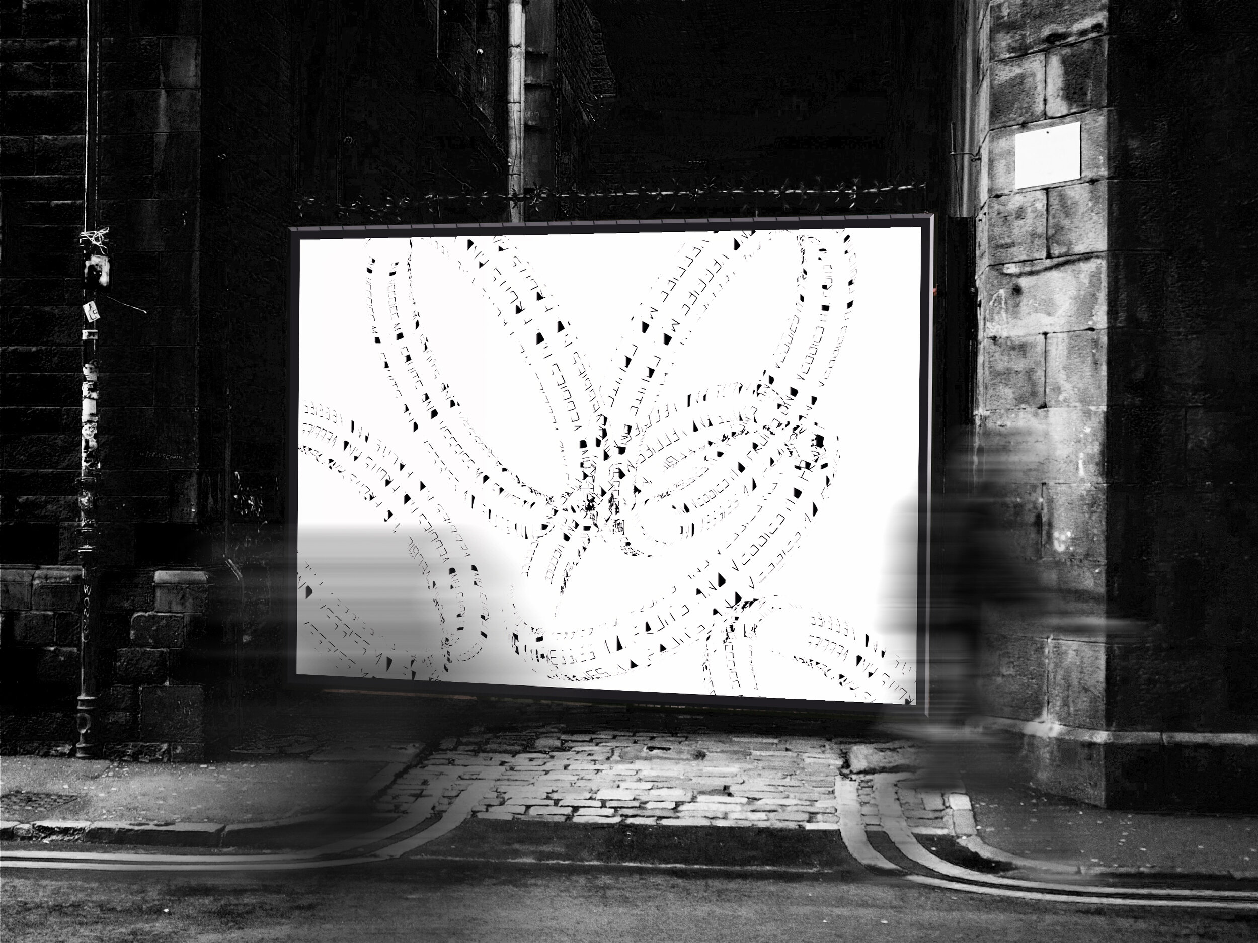
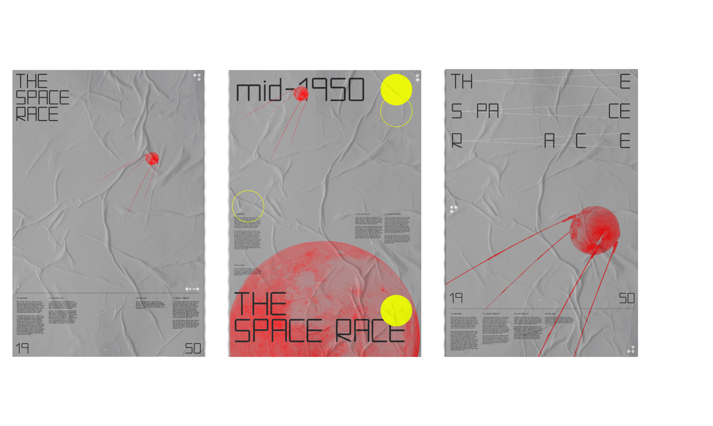
A usable, full family typeface exported as an .otf file. It is displayed in poster design and package/branding design for a theoretical brewery.
S.O.W
Brand Series Development
Typography Development
3-D Print Development
Brand Identity Design
Digital Illustration
Package Design
Poster Design
Programs
Photoshop
Illustrator
Glyphs
Procreate


